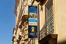
Direct Property
Direct Property aims to make selling property easier by cutting out the middleman, allowing sellers to independently market and ultimately sell their property through the website.
Because selling a property without professional assistance can feel daunting, it was important for the brand to strike a balance between being approachable and friendly while still conveying a sense of quality and trust. The client wanted an elegant visual identity, achieved through the refined typeface and deep navy blue colour palette, complemented by a bright, welcoming yellow.
The archway motif featured within the border invites people to step into their potential new home, while also symbolising an entry point into the world of property. The keyhole and star further reinforce the brand’s aspirational character, suggesting the idea of looking through the keyhole towards new opportunities and a brighter future.
Overall, the identity combines elegance, warmth and aspiration to create a brand that feels both trustworthy and accessible, helping to make the process of selling and buying property feel more straightforward and inviting.
No generative AI was used in the design or creation of this project.